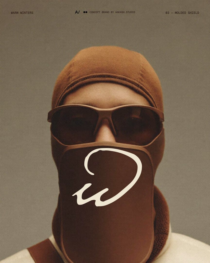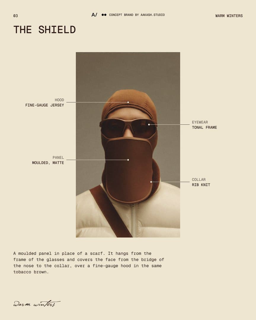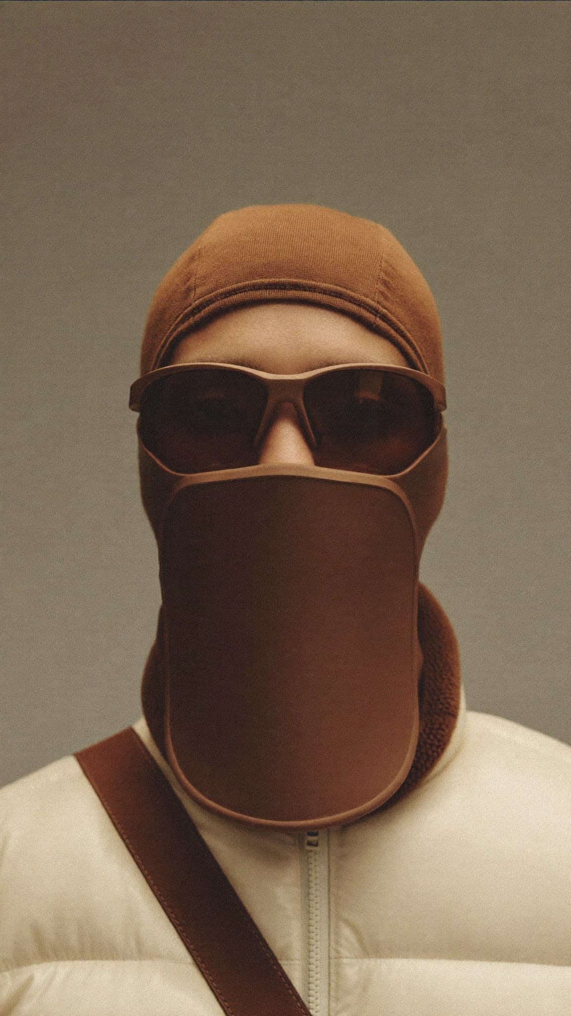
The Shield: a moulded tobacco-brown panel hanging from the frame of a pair of glasses and covering the face to the collar, over a fine-gauge hood, worn with a cream puffer jacket.

Warm Winters

A BRAND CONCEPT FOR WINTER HEADPIECES, ITS IDENTITY AND ITS CAMPAIGN

CONCEPT / FASHIONCOMPLETE

The project

Warm Winters is a brand concept for winter headpieces made for Chicago wind: goggle and mask built as a single piece, so there is no gap between them. The studio made the name, the identity, the art direction and a three-carousel campaign. The photographs are AI-generated. It has not been pitched, sold or produced.

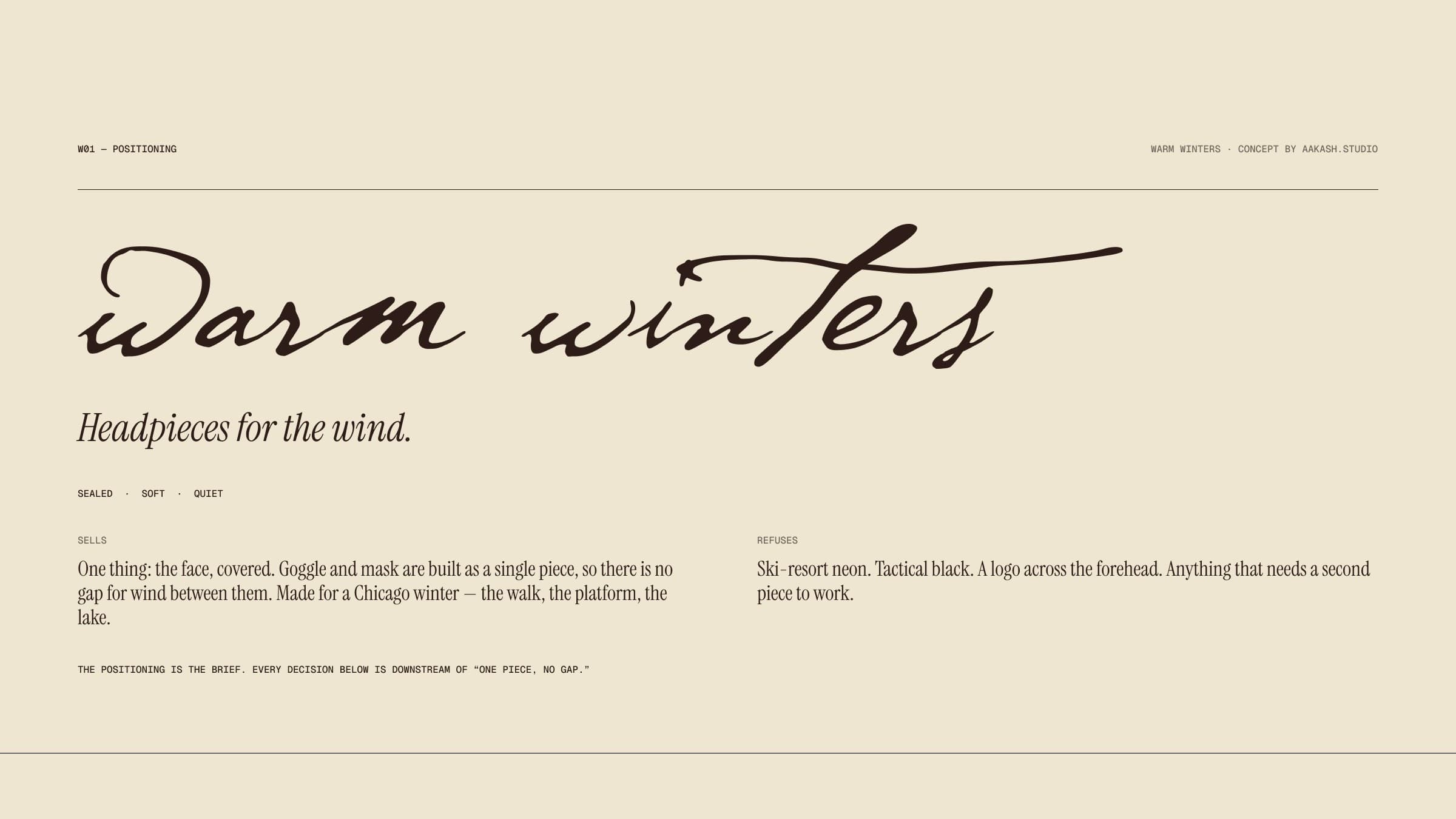
Three pieces: a knit balaclava, a shearling hood and a moulded shield. The brand sells one thing, the face covered, for the walk, the platform and the lake. It refuses ski-resort neon, tactical black and a logo across the forehead. Sealed, soft and quiet.

Client
Warm Winters
Year
2026
Role
Concept — brand and art direction
Services
Name, Identity, Art direction, Campaign
Status
Complete

Branding

The Warm Winters positioning board: the name written in script, the line Headpieces for the wind, the words sealed, soft and quiet, and two short columns on what the brand sells and what it refuses.
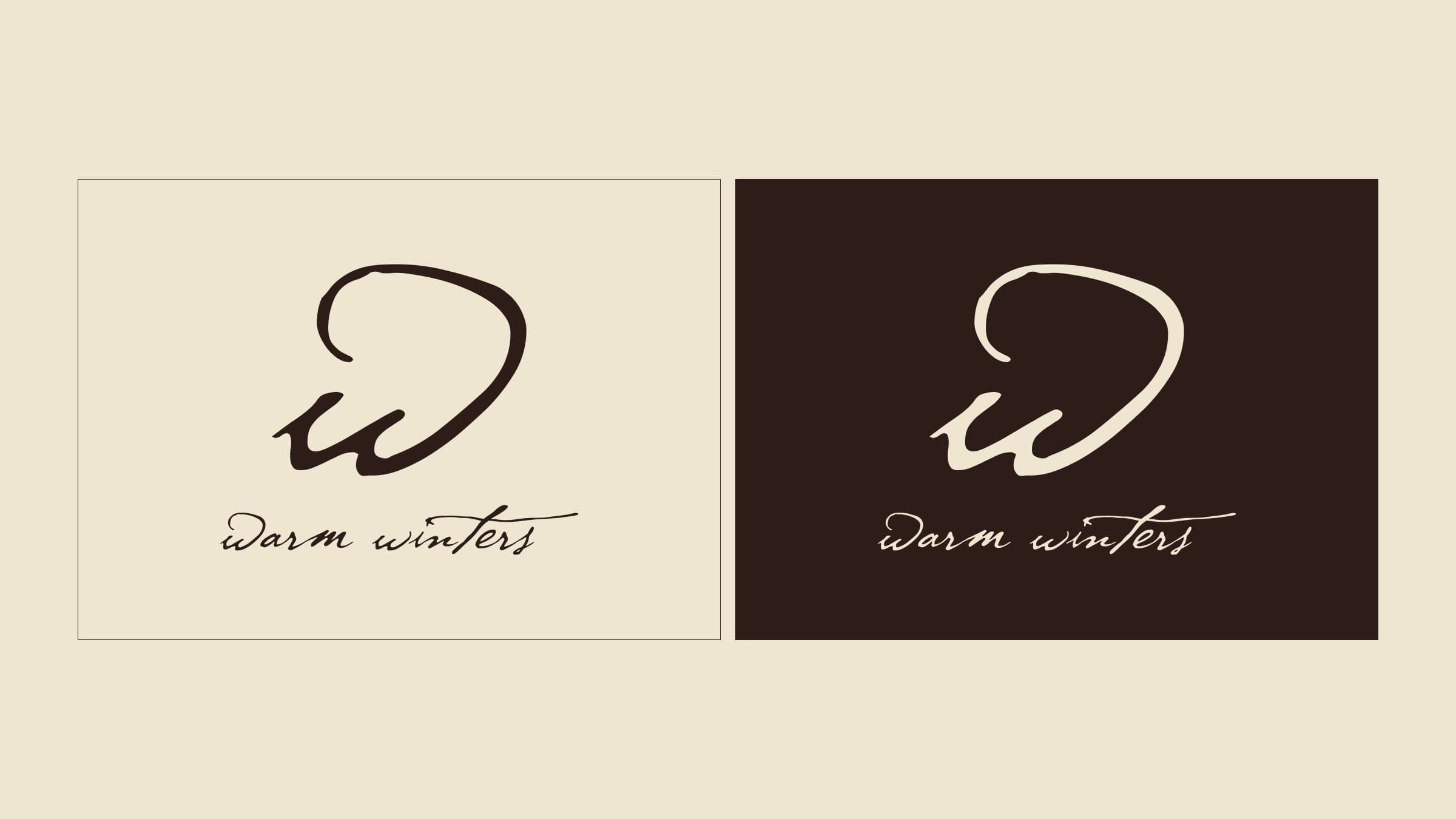
The Warm Winters lockup, a large lowercase script w over the name in the same script, in espresso on ecru and in ecru on espresso.
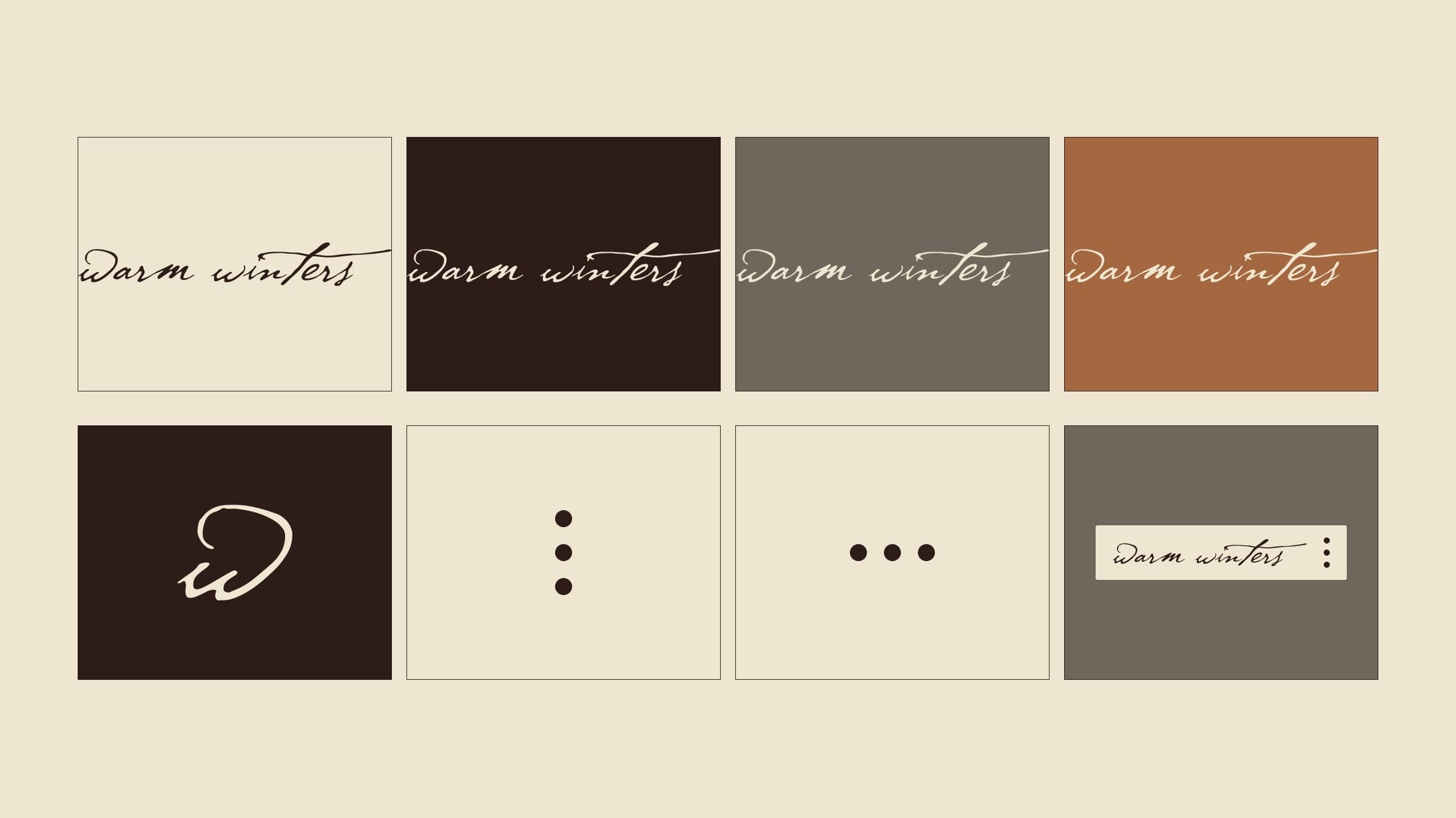
The wordmark on four grounds — ecru, espresso, deep wall and camel — above the w alone, the three snaps set vertically and in a row, and a woven label.
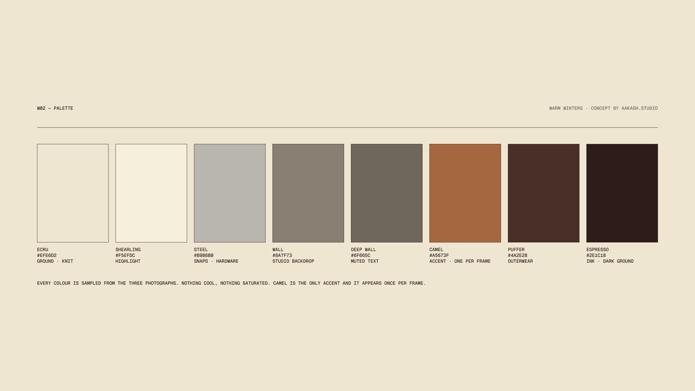
The Warm Winters palette: eight swatches from ecru and shearling through steel, two wall greys and camel to puffer and espresso, each with its value and its use.
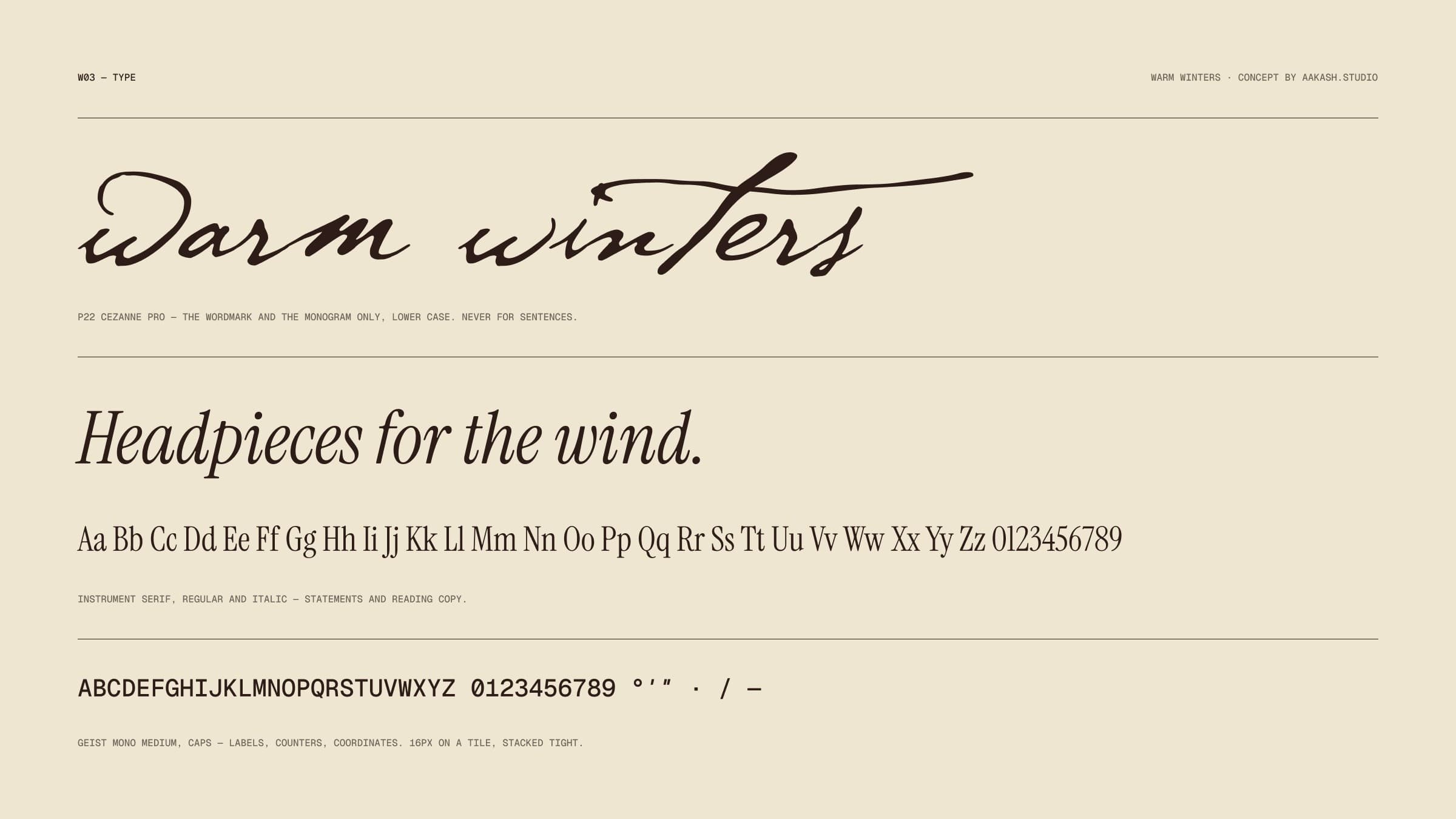
The Warm Winters type specimen: the wordmark in P22 Cezanne, the line Headpieces for the wind in Instrument Serif italic with its alphabet, and Geist Mono capitals for labels.

Campaign

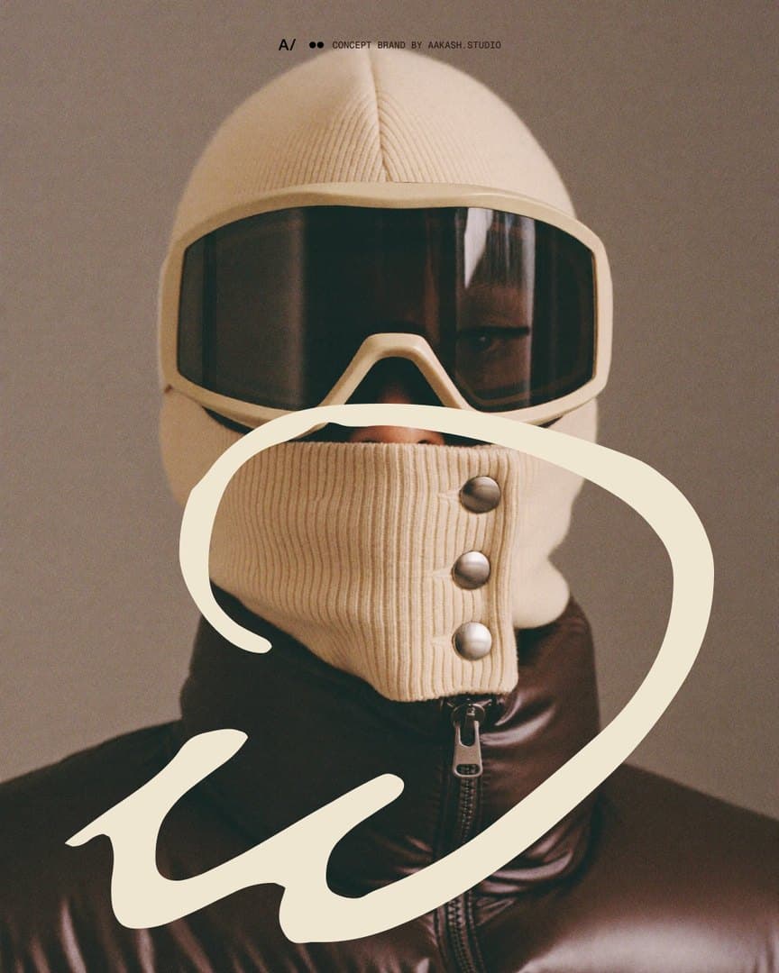
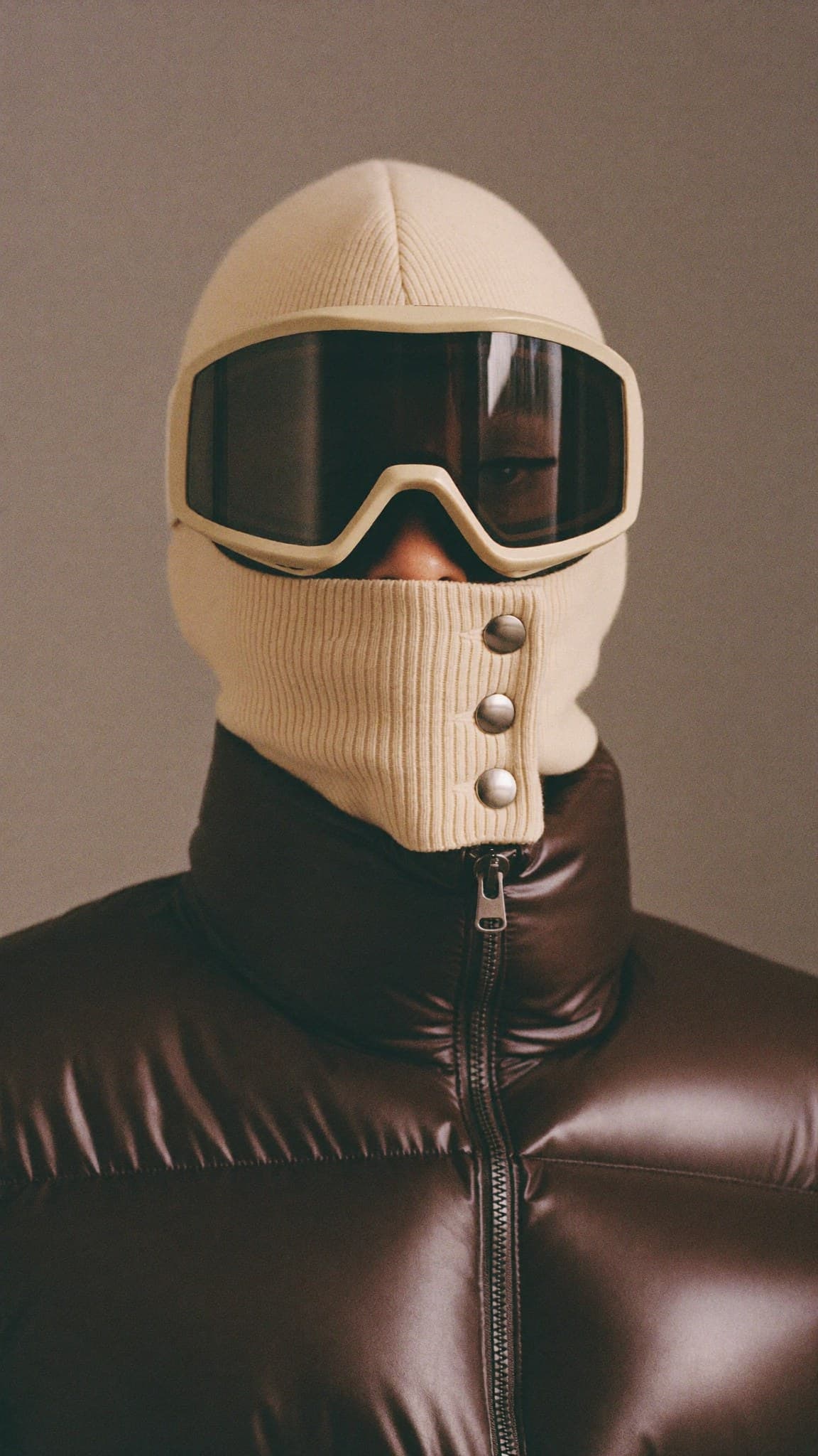
Carousel opener: the knit balaclava and its goggle full bleed, with the lowercase w drawn large in ecru around the snap gaiter.
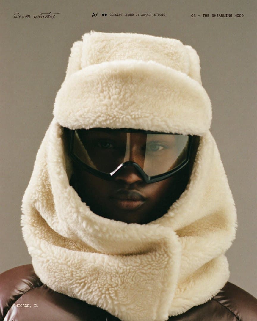
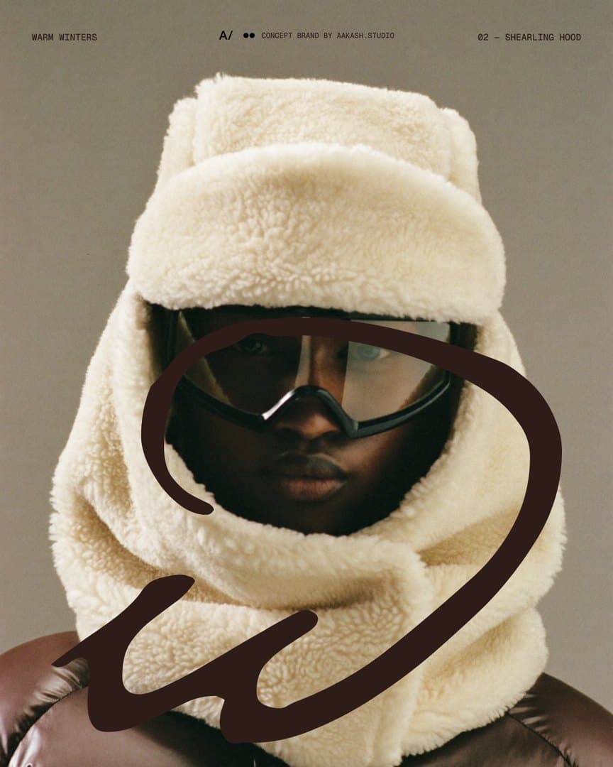
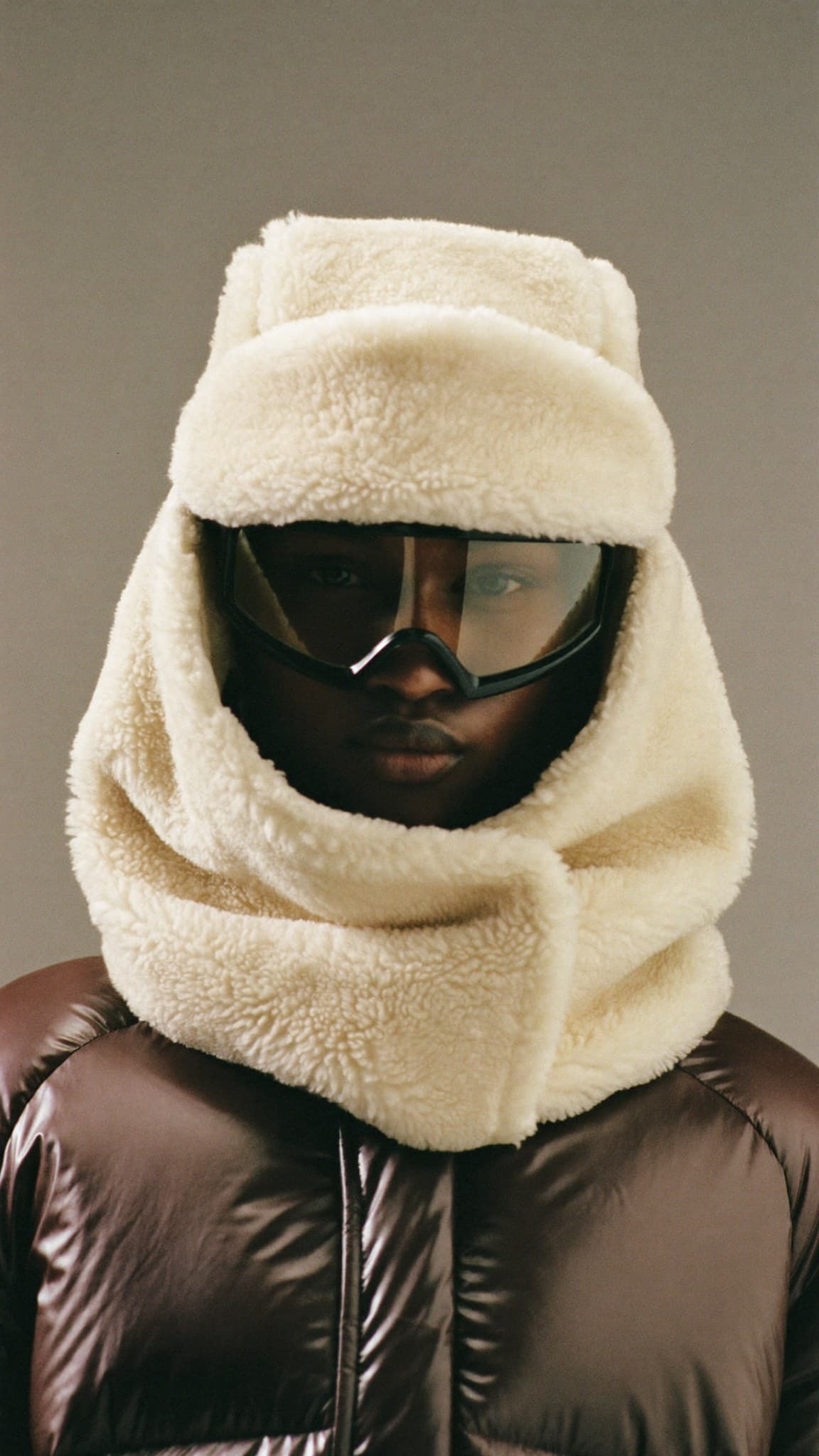
Carousel opener: the shearling hood full bleed, with the small wordmark, the piece name and Chicago, IL set in the corners.
Carousel opener: the shield full bleed, with the w written in ecru on the moulded panel.
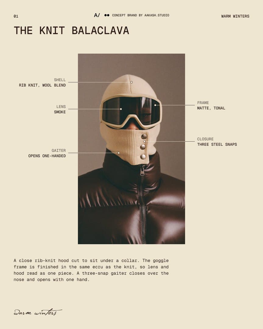
Spec sheet for the knit balaclava: the photograph on ecru paper with hairline callouts for shell, lens, gaiter, frame and closure, and a short description.
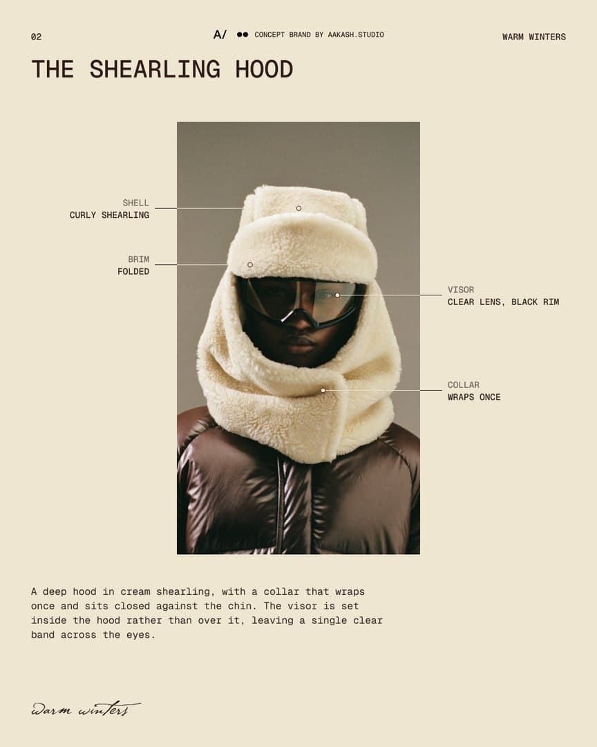
Spec sheet for the shearling hood: the photograph on ecru paper with hairline callouts for shell, brim, visor and collar, and a short description.
Spec sheet for the shield: the photograph on ecru paper with hairline callouts for hood, panel, eyewear and collar, and a short description.
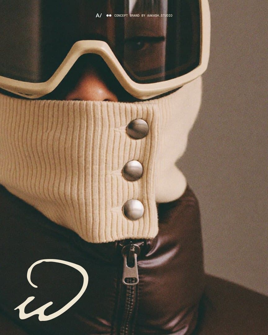
Detail slide: the three steel snaps of the knit gaiter close up, with the small w in the corner.
The shearling hood full bleed with the lowercase w drawn large in espresso across the face.
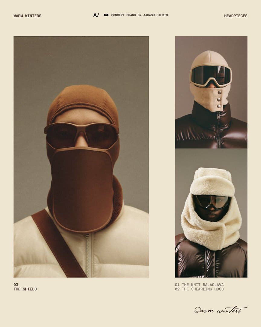
Index slide: the shield at large size beside the knit balaclava and the shearling hood, numbered 01 to 03, with the wordmark.
Closing slide: the wordmark alone in ecru on espresso.
Closing slide: the w over the wordmark in espresso on ecru.
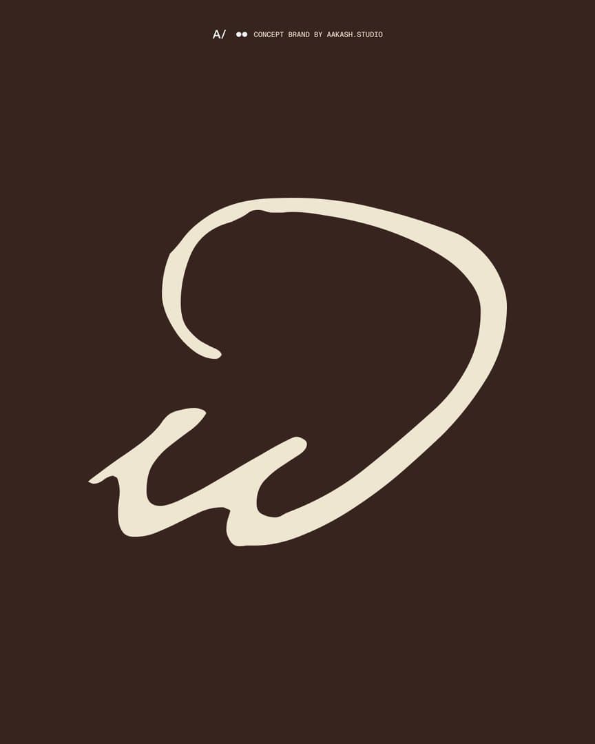
Closing slide: the w alone, large, in ecru on a dark brown ground.

The pieces

The Knit Balaclava: an ecru rib-knit hood with a goggle in the same ecru and a three-snap gaiter over the nose, worn with a dark brown puffer jacket.
The Shearling Hood: a deep cream shearling hood with a folded brim and a collar that wraps once, a clear visor set inside it, worn with a dark brown puffer jacket.
The Shield: a moulded tobacco-brown panel hanging from the frame of a pair of glasses and covering the face to the collar, over a fine-gauge hood, worn with a cream puffer jacket.

The name, written once

The wordmark is the name in script, lower case, written once and left alone: never tracked, outlined or set in capitals. Where it would be too small to hold its hairlines, the lowercase w stands in. The three snaps from the knit gaiter are the only second device.

The palette

Every colour is sampled from the three photographs: ecru, shearling, steel, two wall greys, camel, puffer and espresso. Nothing cool and nothing saturated. Camel is the only accent and appears once per frame.

The campaign

Three carousels, one per piece. Each opens on the photograph with a different treatment of the mark, follows with a spec sheet written the way a product page is, and closes on a different version of the mark.
More work — the rest of the index.